In a world of fancy-schmancy technologies like virtual reality, self-driving cars and robotic dogs, one of the more surprising stories of the past several years has been the resurgence of a decidedly primitive one: vinyl records. In fact, just last month Billboard reported that more than 2.1 million vinyl albums were sold during the week leading up to last Christmas – the biggest sales number since way back in 1991. (My wife says I deserve much of the credit for the boost.)
Like a few other BCHers, I collect records – and I could go on and on about why I love the format: warmer sound, the feel/tangibility, the ritual of placing the disc on the platter and gently lowering the needle, etc. etc. But today we’re going to talk about an element of music that—after decades of being squeezed down into CD jewel cases and even smaller thumbnails of streaming services—has returned to prominence on record shelves everywhere from your local indie shop to Target and Walmart. I’m talking about album art.
You may be thinking, “Records are great and all, but why talk about album art on an ad agency blog?” Well, it’s pretty simple. When you think about it, album covers work in a lot of the same ways as visual brand identities.
Let’s talk about logos and color palettes. On a superficial level, these elements add style, distinctiveness and personality to brands. However, on a substantive level they ultimately become symbols of brand experiences. Therefore, a bad brand experience can’t be saved by a cool logo because the logo will become defined by it. An incredible album cover can’t be redeemed by a crappy album because it becomes synonymous with it.
Since the invention of the LP in 1948, there’ve been a myriad of album covers to achieve “icon” status. These pieces of art have proven timeless, rising above the record shelf to become part of the broader culture, adorning everything from tee shirts and posters to coffee mugs.
As we look at a few of these, consider this question: What is it that makes these album covers so timeless? Is there something at play that we marketers can apply to branding?
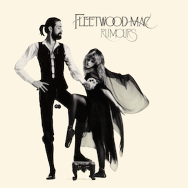
One of the best-selling albums ever, Fleetwood Mac’s Rumours is a hit-filled document of the strife the band faced during the recording of the album. Long story short, the band members were dating one another – and trading around some. The songs reflected the inner turmoil with timeless hits like “Secondhand News” and “Go Your Own Way,” and the cover featuring Stevie Nicks and her then-new beau, Mick Fleetwood, seemed to tacitly acknowledge the drama going on behind the scenes. Top it off with a perfect title and, boom, all-time-classic.
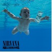
No angst-ridden GenXer can forget this watershed album or its provocative cover depicting a baby chasing a dollar bill. Nevermind’s cover art was a stark metaphor for the frustrating, cradle-to-grave consumerism that awaited a generation of Americans that never really got called to a greater purpose – like fighting a war. Instead, the Boomer-led “greed is good” culture of the 80s pushed GenXers to seek out authenticity and meaning, and Nevermind crystallized their plight with a powerful set of songs and title that resignedly shrugs its shoulders.

Many Beatles albums could make this list, but none are as ostentatious as Sgt. Pepper – the first-ever theme album. The cover photo features the fictional Lonely Hearts Club Band surrounded by a crowd of celebrities and famous figures, and the eclectic outfits and vibrant colors give a visual hint to what’s inside: a milestone collection of innovatively produced and arranged songs that made an instant cultural impact, influencing the works of many Beatles contemporaries including the Beach Boys and Jimi Hendrix.
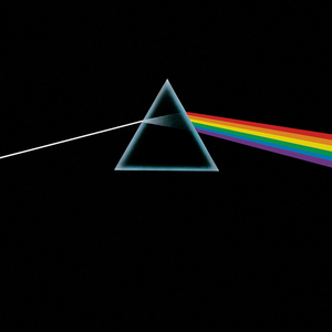
Probably one of the most recognizable covers ever designed, the simple illustration on The Dark Side of the Moon features a white light flying through a prism and coming out the other side as a vibrant rainbow against a pitch-black void. The image serves as a metaphor for the experience of listening to the album, and just like Dorothy crossing over the threshold into a Technicolor Oz, DSOTM opened listeners up to new possibilities in audio production, delivering haunting songs and a sonic experience, unlike anything that came before it.
So let’s look at what these examples have in common and see what, if anything, they can teach us about visual brand identities.
First of all, cover art aside, these albums are significant touchstones of popular music. Secondly, each cover calls either directly or indirectly to the music or theme of the album. Lastly, the covers above are visually stunning – even though, as we’ve established, that’s only a superficial measure that means little on its own. The point is, there is a synergy and cohesion running throughout these examples that any brand would do itself a favor to emulate.
Like timeless album covers, strong visual brand identities are aesthetically sound, represent positive brand experiences – and are distinctive enough to gain a foothold in the broader culture without being easily confused with other brands. What do you think – and what other album covers would you include in our list of icons?
-Steve Morgan, Associate Creative Director
 Previous Post
