
what
No one wakes up excited to be marketed to or have product features shouted at them. But people do invest in stories and experiences that are relevant, well-timed and well-placed. That takes the right tools, the right thinking, and a team that knows how to put both to work.
Explore the capabilities behind the work, and some of the ways we spin WTF business problems into FTW outcomes.
our capabilities
brand management
- Brand Adoption™
- Marketing Strategy
- Account Planning
- Project Management
- Research + Analysis
social media
- Channel Strategy + Planning
- Content Design + Development
- Influencer Marketing + Partnerships
- Scheduling, Publishing
- Paid Campaign Management
- Community Management
- Competitor Monitoring + Analysis
- Social Audits + Training
public relations
- Strategic PR Counsel
- Media Relations – National, Regional, Trade
- Community Relations
- Corporate Communications
- Spokesperson Training
- Crisis Management
- Media Monitoring + Analysis
paid media
- Strategic Planning
- Traditional Buying, Placement
- Digital Buying, Placement
- Campaign Optimization
- Reporting + Analysis
- SEM/SEO
creative
- Creative Strategy
- Ideation + Concepting
- CX Audits + Execution
- BX Audits + Execution
- UX Analysis
- Art Direction
- Copywriting
- Graphic Design
- Photography + Illustration
- Audio/Video Production
- Motion Graphics/Animation
- Website Content Strategy + Development
- Email Marketing/CRM

old soul. new vibe.
business problem
The historic steam-powered paddlewheeler Belle of Louisville was a beloved local icon—but locals increasingly saw her as a relic of their past, not a destination for today. Despite expanding from a single dinner cruise to more than 20 experiences, awareness of the new offerings remained low. The Belle needed to win back local audiences and attract a younger generation.
human truth
People hadn’t stopped loving the Belle. They’d simply stopped thinking about her.
To bring her back into their lives, we needed to remind Louisvillians that the Belle wasn’t just something they remembered. She was something they could experience now—and have a lot of fun doing it.


bch strategy
We gave the Belle a modern glow-up without losing what made her iconic.
We brought her to life as a new kind of party girl: a character styled as a glamorous ’20s flapper tucked inside a costume of the historic riverboat. She became the face of the brand’s transformation, helping people see the Belle in a completely new way—and showcasing her as the host of some seriously fun experiences.
We introduced the character through video, outdoor and paid social, disrupting the expected way people thought about the historic riverboat. Once we had their attention, we shifted the spotlight from the Belle herself to the parties she hosts, using influencers, pedestrian boards and digital outdoor to bring those experiences to life.
Our layered approach made the campaign feel less like advertising and more like a recommendation from someone who knows where the party is. Influencers provided a third-party endorsement of the fun happening onboard, while “Do Whatever Floats Your Boat” became the rallying cry across paid media, social and grassroots efforts.
results
The campaign repositioned the Belle as a relevant, must-visit Louisville destination—and brought her out of reminiscence and back into relevance.
More importantly, the campaign contributed to the Belle’s strongest attendance year in nearly two decades, with more than 89,000 passengers coming aboard.
• Most passengers in nearly 20 years
• Paid media impressions 45% above projection
• $3.71 CPM — significantly below the $5 target
• 0.24% CTR — more than double the projection and nearly 5X industry average
• Increased website traffic and multiple sold-out cruises
Services
Organic + Paid Social | Digital Display | Motion Graphics + Animation

a blank wall. a bigger purpose.
business problem
Right in the middle of downtown Louisville, surrounded by restaurants, hotels, sports venues and performing arts centers, sat a big, gray concrete box that was a bit of an eyesore. Operated by Louisville’s Metropolitan Sewer District (MSD), the 4th Street Pump Station did an important job protecting downtown from flooding—but did absolutely nothing for the neighborhood around it. MSD knew it needed a makeover. And we saw an opportunity to make it more than that.
human truth
Sometimes the things we overlook are hiding in plain sight. What if we stopped seeing the pump station as a building—and started seeing it as a blank canvas?


bch strategy
We teamed up with a local muralist to transform the entire four-sided pump station into a celebration of water, nature and Louisville. The two-story mural brings MSD’s mission to life, showing the river, the land and the animals that depend on clean, healthy waterways.
Shimmering mosaic tiles capture the beauty and movement of water. And importantly, there was no overt MSD branding on the mural itself. We wanted it to feel like a true piece of public art—not an advertisement. The only brand connection was a small QR code on a plaque, inviting curious passersby to discover the story behind the mural, MSD’s mission and the meaning behind the artwork.
Instead of hiding the pump station, we made it something people would actually stop and look at.
results
A once-forgettable utility building became a vibrant piece of public art—and a new downtown landmark. The mural doesn't just fit into its surroundings. It adds to them.
By keeping the branding subtle, the artwork could belong to the neighborhood first and the brand second. For those who wanted to know more, the small QR code provided a deeper connection to MSD’s story, mission and the meaning behind the art.
And every evening at sunset, the water-inspired mosaic catches the light and gives passersby a little reminder of the beauty MSD works to protect.
Services
Organic + Paid Social | Digital Display | Motion Graphics + Animation

what if tradition was just the beginning?
business problem
Buffalo Trace Distillery had a great story—more than 200 years’ worth. But with its product lines on allocation and a crowded, ever-changing bourbon category, the brand needed to stay relevant and top of mind.
The challenge: How do you stand out when everyone has a bourbon story to tell?
human truth
Bourbon lovers respect tradition. But they also appreciate the people who challenge it.
Our consumer research showed that bourbon enthusiasts valued Buffalo Trace for its independence, pioneering spirit, leadership and history.
That led us to a simple realization: the Buffalo Trace Distillery’s greatest tradition might actually be not being afraid to change things.


bch strategy
Leadership is in the DNA of Buffalo Trace. For generations, the distillery has pushed bourbon-making forward while staying true to the traditions and craftsmanship that define the category.
But leadership and innovation don’t just happen. They start with curiosity—with challenging the status quo and having the courage to ask, “What if?”
That became the creative thread for our brand-anthem video. We brought Buffalo Trace’s history of innovation to life by showing how that simple question has helped shape the distillery for more than 200 years.
Because every breakthrough starts with someone willing to ask, “What if?”
And because Buffalo Trace Distillery is home to roughly 20 other brands, the work was designed to represent the entire family—not just Buffalo Trace Bourbon.
results
The resulting video aired nationally during Yellowstone, one of the country’s most popular television shows.
And the work earned Gold at the American Advertising Federation U.S. Regionals.

handcrafted spirit
business problem
For nearly 30 years, the Kentucky Bourbon Festival has brought bourbon lovers to Bardstown to celebrate the history, culture and craftsmanship behind Kentucky bourbon.
Every year, the festival commissions a commemorative poster—but previous designs largely followed the same photographic, headline-driven formula. KBF needed something that could make its annual poster feel as distinctive and collectible as bourbon itself.
human truth
Bourbon isn’t just something you drink. It’s something you hunt, collect and appreciate. It’s about craftsmanship, history and the human hands behind the finished product. So why should the festival poster feel mass-produced?

bch strategy
We went back to the roots of bourbon—and made the poster the old-fashioned way.
Instead of photography and a big theme line, we created a handcrafted, two-color woodcut illustration featuring playful bourbon references like white dog, a whiskey thief and rack houses.
Then we took the idea all the way: the design was hand-carved into a wooden printing block and produced one by one on a 19th-century printing press, echoing the era when Kentucky’s bourbon industry was born.
No clever headline was needed. Just the festival name, dates and artwork that told the story.
results
The poster immediately became something people wanted to own—not just something they wanted to see.
Bourbon enthusiasts and festival collectors quickly snapped up the initial run of 125 hand-numbered, hand-pressed, artist-signed prints. Additional duplicate prints were made available for sale.
The result: a festival poster that became a collectible piece of bourbon culture in its own right.
from shelf-stable to top shelf
business problem
Reàl Infused Exotics had a great product. What it lacked was the right perception. Some people had never heard of it. Others saw it as just a mixer. We needed to build awareness and help the brand take up more space in people's minds.
human truth
Most people do not reject a product because it lacks value. They overlook it because they think they already understand it. And lumping Réal into being just another mixer was a poor assumption.


bch strategy
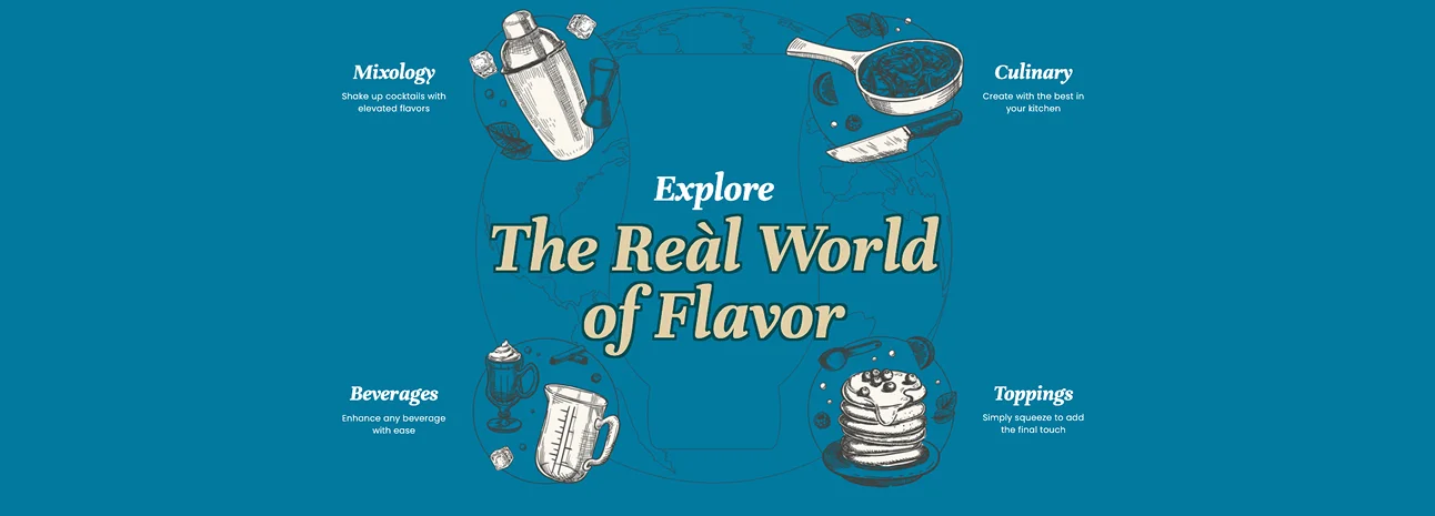
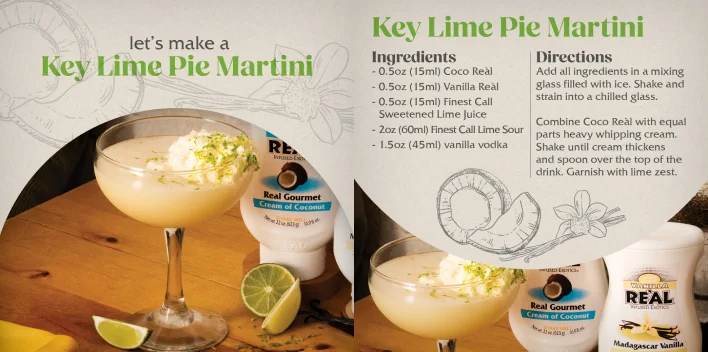
We repositioned Reàl from functional flavor add-in to quality flavor experience. By focusing on real ingredients, global sourcing, and the sense of discovery behind each flavor, we gave people a fuller reason to notice the brand and remember it.
results
Story-led content drove stronger engagement, flavor-forward creative performed better when it felt experiential, and creator partnerships helped make Reàl feel premium without feeling distant. The result was a clear shift in perception: Reàl came to be seen as a top-shelf brand with top-quality ingredients.
Services
Organic + Paid Social | Digital Display | Motion Graphics + Animation
resurrecting a brand
business problem
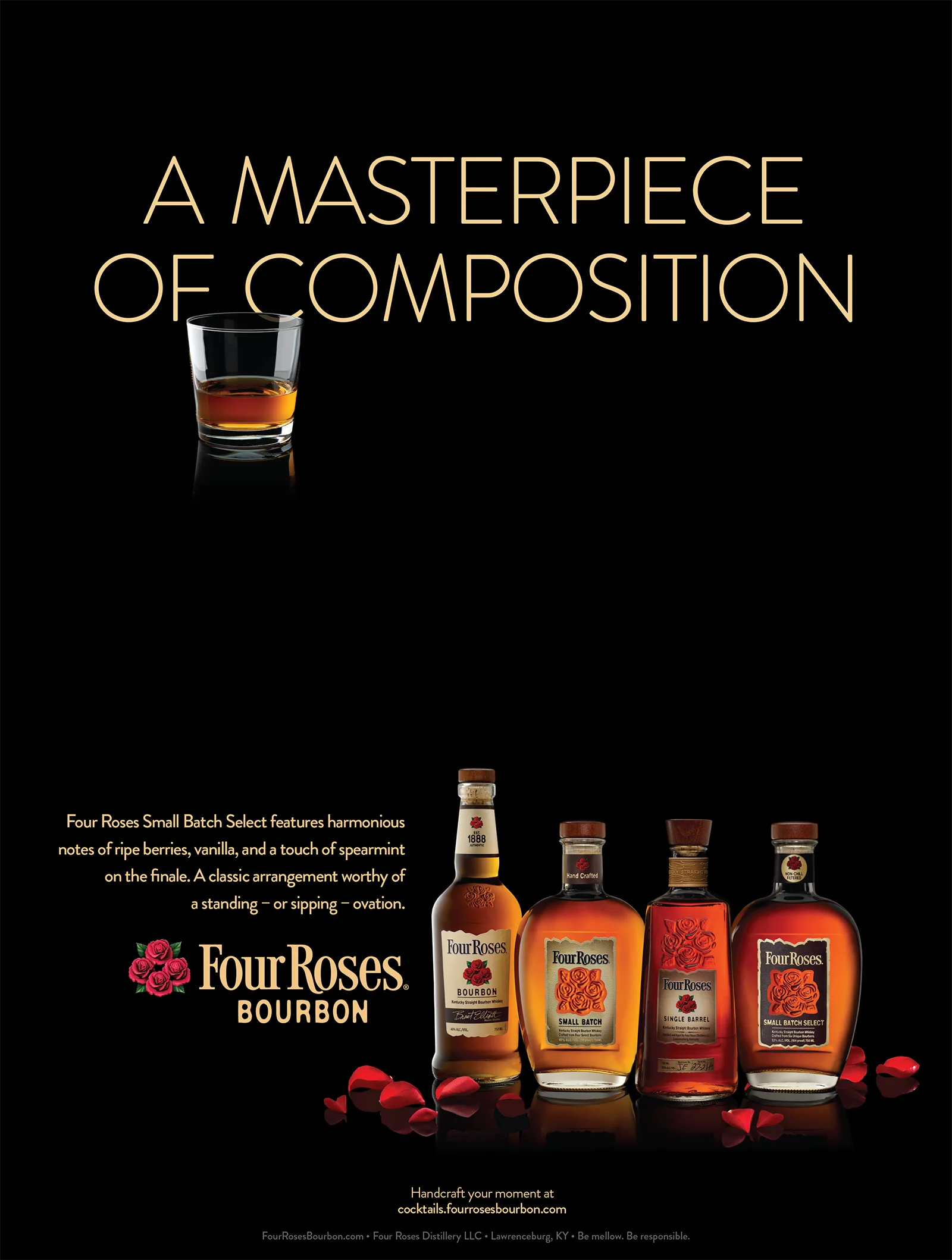
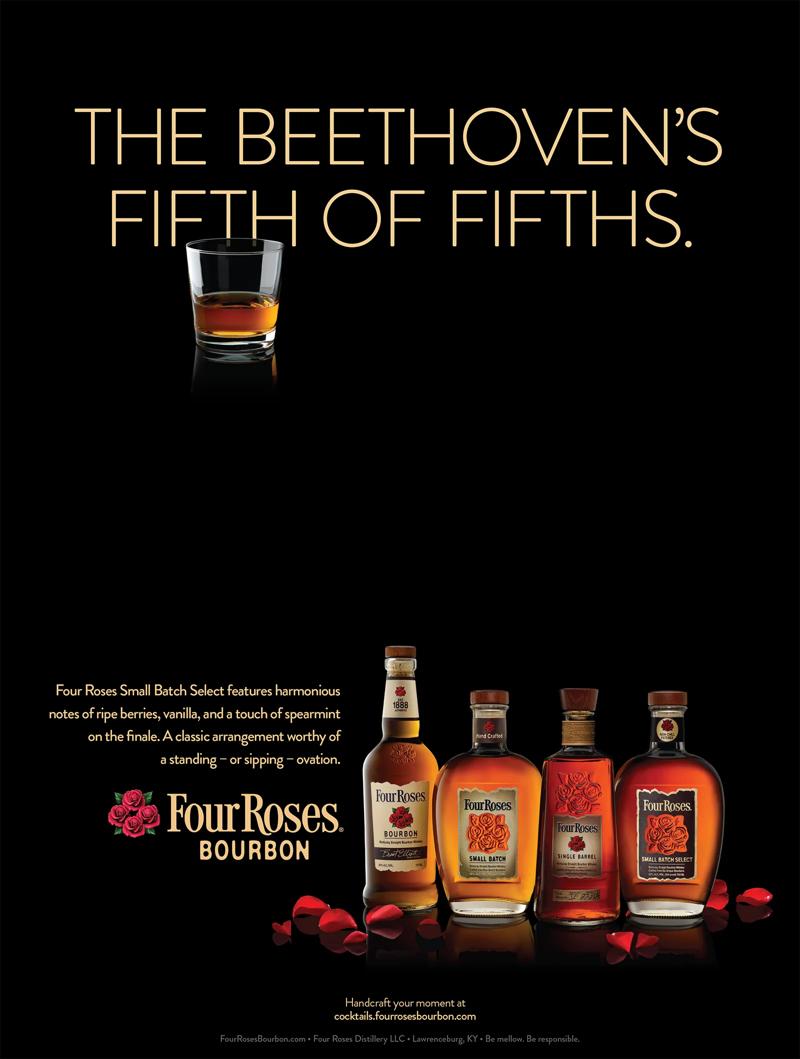
When Four Roses returned to U.S. shelves after a 50-year absence, it was not coming back to a clean slate. The name was known, but not in the right way. Many consumers saw it as a bottom-shelf blended whiskey, not a bourbon worth seeking out. The challenge was to rebuild credibility and give people a new reason to see the brand differently.
human truth
For bourbon drinkers, what is in the glass says something about the person holding it. They are drawn to brands with real craft, real character, and a story worth knowing. If a bourbon feels generic, they move on. If it has depth they can taste and talk about, they lean in.
bch strategy
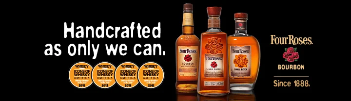
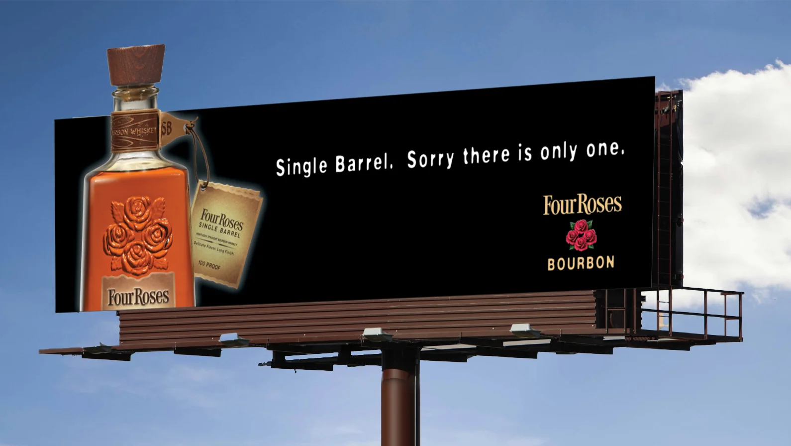
We reintroduced Four Roses through credibility, not nostalgia. By leading with Single Barrel as the flagship, we gave bourbon enthusiasts a reason to take a fresh look. Then we centered the brand's ten unique recipes as the proof behind its quality and distinction, giving the brand something ownable and drinkers something worth discovering.
results
Four Roses grew from 3,000 cases in 2005 to more than 1 million by 2021. Based on run rates, it became "America's Fastest Growing Bourbon" in 2021 and earned a top-five share of voice in bourbon social conversation alongside much larger brands. Most importantly, Four Roses was no longer seen for what it had been. It was respected for what it is.
developing the "easy" advantage
business problem
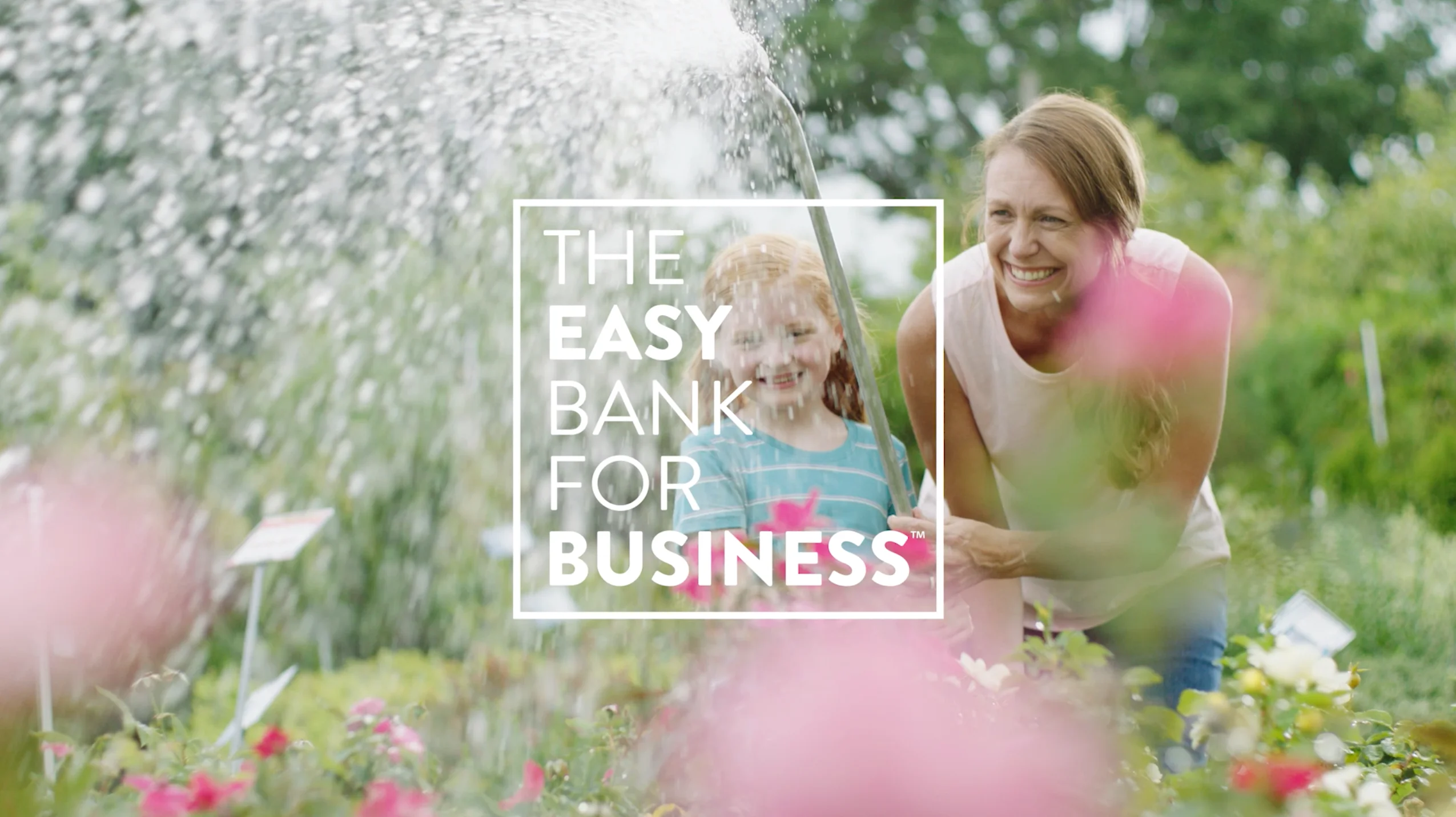
Republic Bank had strong reputation in lending, but gaining market share required more. And with larger competitors reshaping the market, the brand needed distinction and a clearer reason for people to choose it.
human truth
People expect banks to offer the basics. What they remember is how the experience feels. When banking feels confusing, slow, or harder than it should be, trust erodes quickly. What people wanted was a bank that made everyday financial life to be simpler.
bch strategy
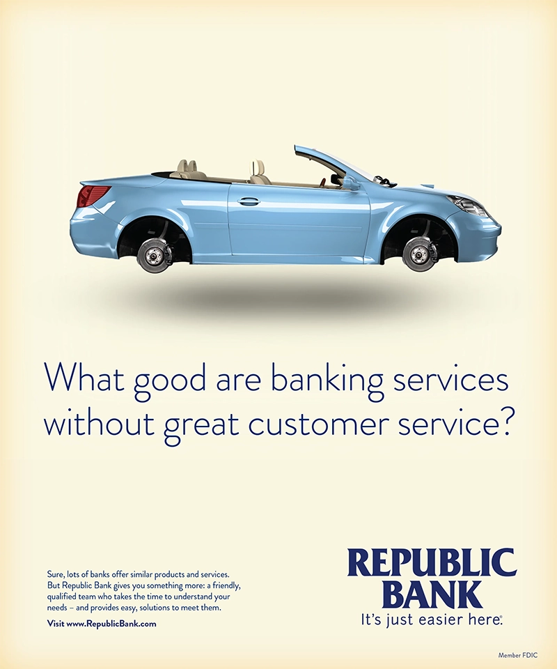
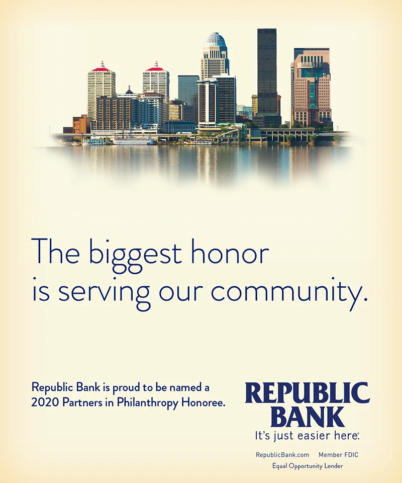
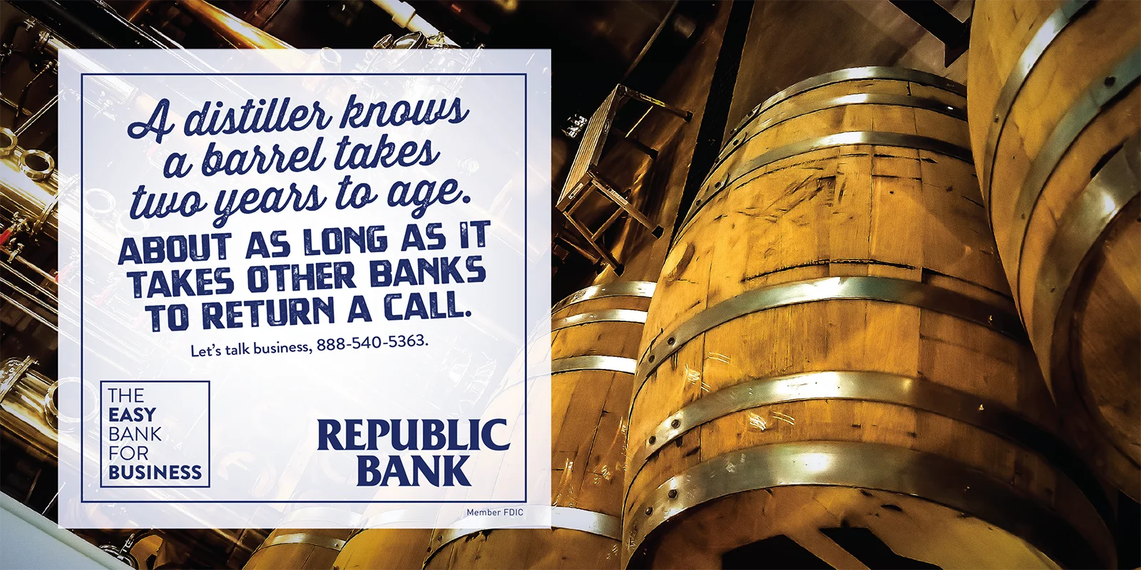
We positioned Republic as the easiest bank to do business with. But a promise like that only works if people can see it. So we started inside the organization, helping shape the culture, systems, and mindset around making banking easier before bringing that idea to market.
results
Since launching in 2014, the "easy" brand has driven double-digit growth across key metrics, including strong gains in checking accounts, earnings, and stock price. And consistently high NPS scores make it clear this was not just a promise made, but a promise kept in a crowded, competitive category.
Services
Organic + Paid Social | Digital Display | Motion Graphics + Animation
distilling the essence of a city
business problem
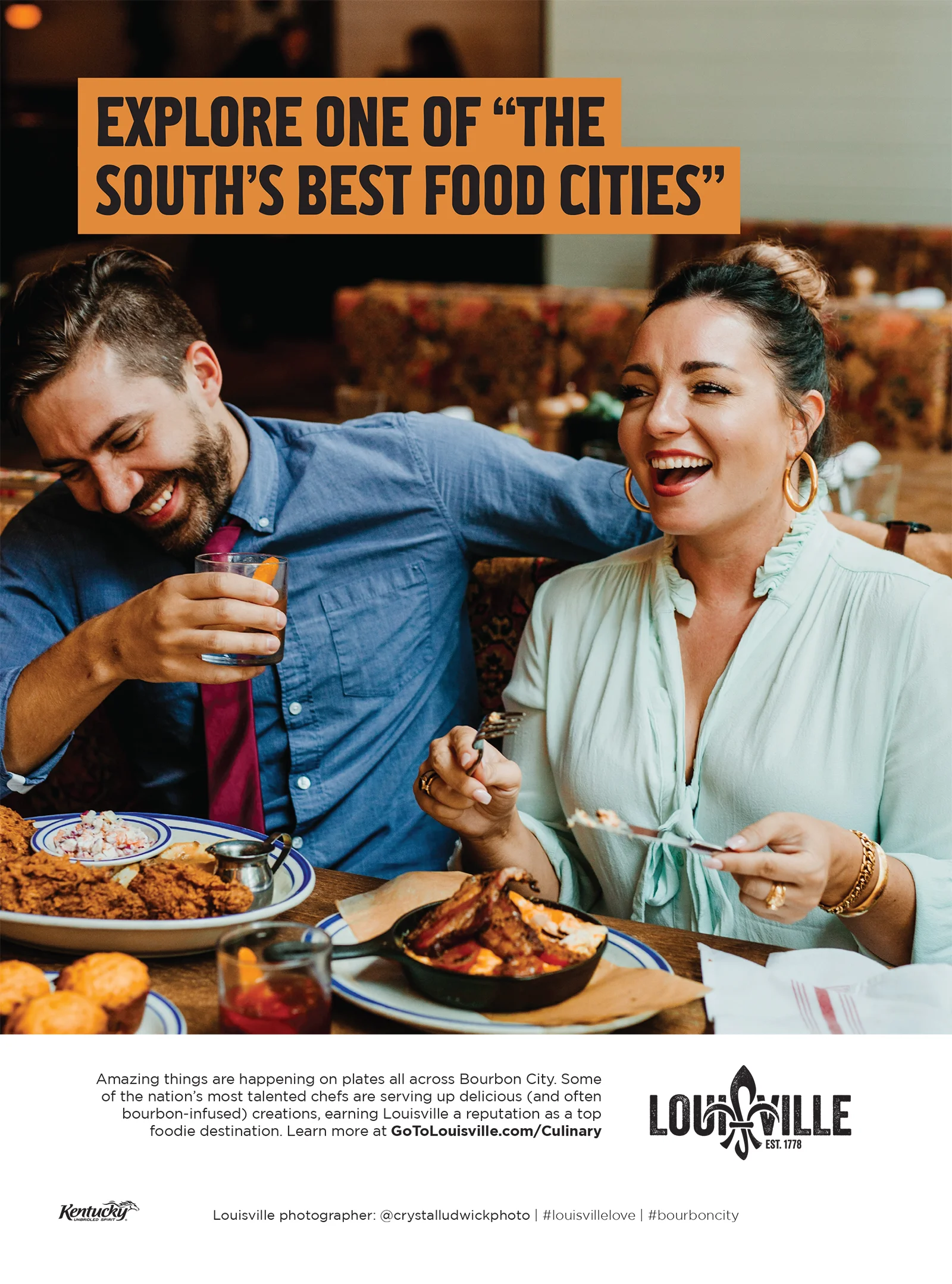
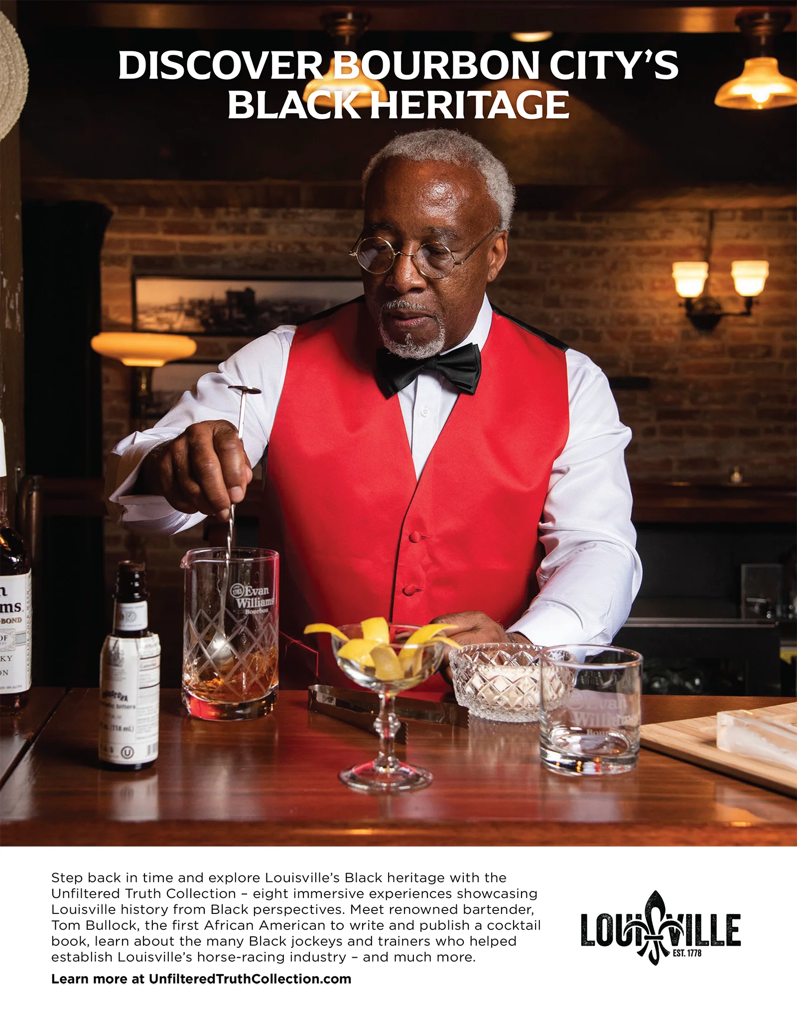
Louisville was known for a few defining icons, but that reputation only told part of the story. The city also had a thriving food scene, rich culture, and a distinctive mix of Southern hospitality and progressive energy. It needed a clearer destination story that could bring those strengths together and give people a stronger reason to visit.
human truth
People do not choose cities based on a list of attractions. They choose places that feel distinctive. A clear point of view gives them a reason to go, and a richer experience gives them a reason to stay.
bch strategy
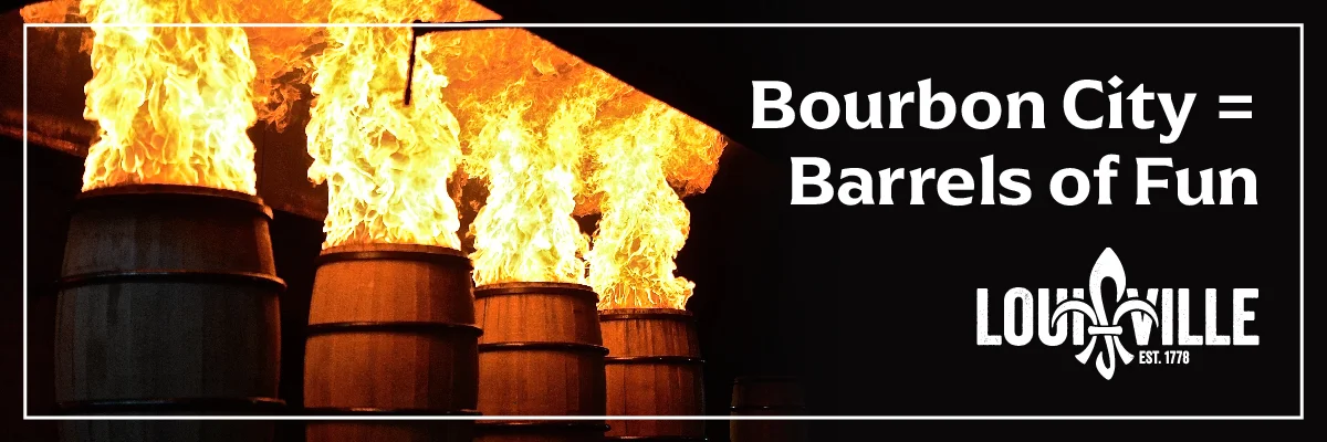
We helped launch the "Bourbon Country" campaign, positioning Louisville as the perfect starting point for bourbon exploration. The campaign did so well the city's role changed. As distillery experiences opened in Louisville itself, the city became more than a gateway. It became the destination. That shift led to a simple, powerful idea: Louisville is Bourbon City.
results
The idea changed how the city was experienced and how it saw itself. Bourbon City began influencing everything from food and events to culture and tourism. By 2022, hotel bookings had surpassed pre-pandemic levels for the first time, showing the power of a destination story people could quickly understand and genuinely want to be part of.
Services
Organic + Paid Social | Digital Display | Motion Graphics + Animation

307 W Muhammad Ali Blvd
Louisville, KY 40202
502-589-7711